Portfolio Analysis with Synthetic Intervals: Beta Release
Portfolio triage tool for identifying sites with high solar and storage savings potential
Portfolio Analysis - Workflow Overview
The beta release of Portfolio Analysis with Synthetic Intervals is designed as a two step workflow, where each step is supported by a dedicated endpoint.
- Step I: Initially, the service takes in building information from the user and searches our database for profiles that match the characteristics of the given site. The set of matched profiles is then analyzed for variance across a number of different dimensions that determine whether the building is a good candidate for Behind the Meter (BTM) solar and storage installations. Importantly, this first step does not return a specific usage curve. Rather, it provides a statistical summary of all potential usage curves, allowing the user to assess match quality (curve convergence), DER suitability (compatibility scores), and to select a specific profile to use in downstream analyses.
- Step II: the user then has the option of retrieving the usage curve associated with their selected profile.
For more information on how Portfolio Analysis works see the Product Guide.
To call the Portfolio Analysis endpoints users must first have access to the Arc Platform. The following document is a step by step walkthrough of how to set up your organization on Arc and then proceed with the Portfolio Analysis flow.
Getting started on Arc
Setting Up Your Organization on the Arc Plarform
If you already have a legacy Utility Cloud account, you can access the Dashboard using your same username and password.
If you are a new or prospective customer, Arcadia will create a new organization for your team and send an email to you to enable access to the Dashboard. You will receive the email from [email protected] with instructions on how to finish setting up your account. The link in the email will send you to the Dashboard log-in page at https://dashboard.arcadia.com where you will be prompted to set your permanent password. You will then be able to log in to the Dashboard using that email and password you just set.
You can update your Dashboard password at any time by clicking the Reset Password link on http://dashboard.arcadia.com.
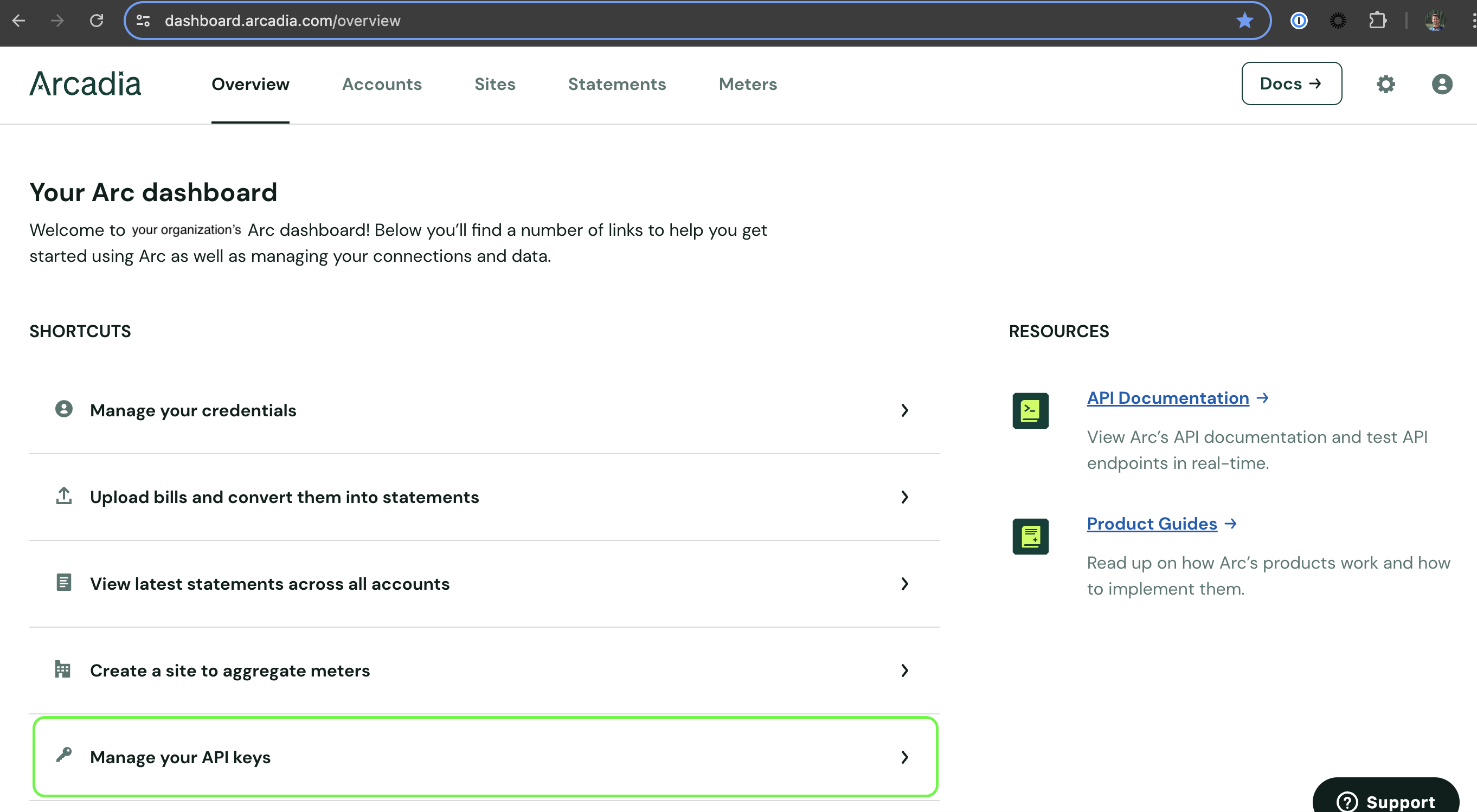
Getting your Client ID and Client Secret
Once you have access to your organization’s dashboard, navigate to the ‘Manage your API keys’ from the ‘Overview’ tab to get your Client ID and Secret. Alternatively use the following URL to go straight to the ‘API Key’ page: https://dashboard.arcadia.com/configuration/api-keys
Generating a token for the Synthetics service
Use API credentials from your Arc Dashboard to create an Access Token that has permission to use all Arc API endpoints. API access tokens are valid for one hour.
Please see 'Generating Access Token' example in this recipe:
Using the Synthetic Intervals Service for Portfolio Analysis
Step I: Profile Search
The first call in the Portfolio Analysis workflow is to the Synthetic Intervals Search endpoint.
POST <https://api.arcadia.com/syntheticIntervals/search>
The endpoint takes in building attributes for the given site and returns the summary statistics for the profiles that matched the user's query. The objective of Step I is not to return a single usage curve but rather to provide the user with an overview of the quality of the matches and, by extension, our confidence in the site's DER savings potential - be it low or high.
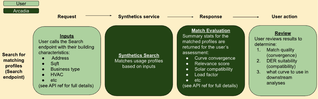
There are two types of calculated metrics returned by the Search endpoint: a convergence score and a collection of compatibility scores. Each is designed to help guide users through the portfolio triage process. Detailed below are descriptions of select metrics along with an explanation of how they are meant to be interpreted. For full details on both the request and response fields, please see the API Reference.
Convergence score: A composite score representing how tightly clustered the curve shapes of the matched profiles are [0-1].
- A site with a high convergence score indicates to the analyst that the set of possible proxies generally follow the same usage patterns and share a common load shape. This makes choosing a specific curve easier as the differences between the matched profiles will not lead to meaningfully different results in downstream analyses.
- Alternatively, a site with a low convergence score means the service matched the site to a wide variety of profiles, each with significantly different load shapes. In this case, it is much harder to ascertain which of the curves to use. Sites with poor convergence are generally a result of low information queries and can be improved by repeating the request with more complete inputs. In some cases, however, low convergence reflects a lack of similar sites in our database - examples include rare building types (large office in a rural county) or incompatible inputs (a 100 square foot hospital, or a site with 1,000 kW of annual demand but only 100 kW of usage).
Compatibility score: A collection of calculated values aimed at quantifying the suitability of the site for BTM solar and storage - below is a non-comprehensive list of the available Compatibility Scores.
- Solar score: % of usage in daylight hours. The higher the value, the more a site can benefit from solar.
Load factor: Defined as consumption (kWh) divided by demand peak (kW), averaged over billing periods. Load factor is a common industry standard for evaluating how smooth (vs. “peaky”) a curve is. Higher scores indicate smooth consumption, while low scores indicate more spiky behavior. In general, a low load factor is associated with sites that could benefit from storage. - Peak Magnitude: Defined as daily demand peak (kW) divided by average daily consumption, averaged days in the year. Higher magnitude typically translates into higher demand charges on the utility bill and represents an opportunity to offset costs with DERs - solar, storage, or both.
- Daily peak hour: Most common daily demand peak (annual mode). Whether peaks happen during daylight hours or after the sun sets can help guide analysts toward the importance of storage in managing electricity costs.
Annual demand: Maximum power peak (kW) within the year. Higher annual demand peaks generally represent larger DER savings opportunities. - Annual usage: Total kWh used within the year. Higher consumption generally represents larger DER savings opportunities.
At a high level, sites may fall into one of three categories:
- High convergence score and high compatibility score - indicative of a building that’s likely to benefit from BTM solar and or storage.
- High convergence score and low compatibility score - indicative of a building that’s not likely to benefit from BTM solar and storage.
- Low convergence score - indicative of a site that lacks enough information to determine whether it would benefit from BTM solar and or storage, or indicative of a site whose usage patterns differ significantly from those in our database.
Sites that fall into categories 1 and 2 can quickly be advanced into the next phase of project development or deprioritized, respectively. However, sites with low confidence scores that belong in category 3 will require additional attention from the analyst. The extent to which they are worth exploring further will depend on the user and the use case. For additional guidance on how to navigate low convergence scores, please see the Portfolio Analysis product guide.
Please see 'Searching for Synthetic Intervals' example in this recipe:
Step II:
The second call in the Portfolio Analysis workflow is to the Synthetic Intervals Curves endpoint.
GET https://api.arcadia.com/syntheticIntervals/curves/{intervalId}
Once a site is designated as having enough DER savings potential to pursue additional analyses (outcome of Step I), the user will likely want to select a specific usage curve to work with. To do this, simply send the curve ID along with a date range and time step granularity to the Curves endpoint.

The response will include the specified intervals curve along with metadata about the associated profile (location, square footage, business type, HVAC, etc.). For full details on both the request and response fields, please see the API Reference .
Please see 'Getting Synthetic Intervals Curve by ID' example in this recipe:
Updated 5 months ago